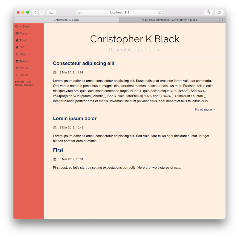
I promise not all my blog posts will be about formatting my blog posts, but Hugo’s default {{ .Summary }} is real ugly:

This collapses the first 70 words of the post into one unformatted paragraph, with headers and text and even fenced code blocks all mashed together. I’m also not a fan of how it omits images without any indication—note the lack of a “Read more” on the first post. I assumed at first that I must be doing something wrong, but apparently it’s been this way for years.
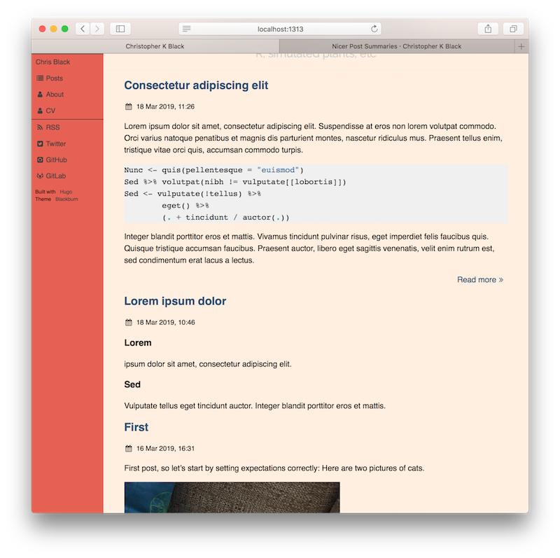
I usually prefer longer summaries before clicking through anyway, so I overrode my theme’s layouts/_default/summary.html to render the entire first two paragraphs, including images:
<article>
  <header>
    <h2><a href="{{ .Permalink }}">{{ .Title }}</a></h2>
    {{ partial "post_meta.html" . }}
  </header>

  {{ $paras := split .Content "</p>" }}
  {{ range (first 2 $paras) }}
    {{ . | safeHTML }}</p>
  {{ end }}

  {{ if not (findRE "^[[:space:]]*$" (index $paras 2))
	/* empty string = whole post fits in summary = don't show footer */ }}
  <footer>
    <a href="{{ .RelPermalink }}">Read more<i class="fa fa-angle-double-right fa-fw"></i></a>
  </footer>
  {{ end }}
</article>

Note that technically we’re showing “everything up to the second </p>”, not “the first two chunks of text”; specifically, it will render an unlimited number of headers and code blocks (Hugo wraps code in <pre> not <p>) until it has found two paragraph elements. I’m sure this will become annoying for some cases, but for now I like it a lot better than the default.